Role User Research, UX/UI Design Team MBA: Aditi Dugar, Elaine Lai, Lorenzo Zavala, Monica Myers. ME: Ivan Pham Client American Express Year 2015
iPad Kiosk for American Express Serve Cards
Project Background
In 2015, American Express (AmEx) and Wharton Innovation & Design Club organized a design challenge jointly, expecting creative user experience solutions generated by student teams for its Serve card product. I joined the competition as a designer, and formed a hybrid team with teammates from business and engineering backgrounds.
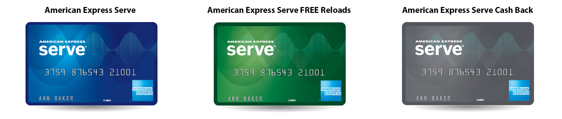
Serve Card Products
Serve card series is a new kind of prepaid cards developed by American Express (AmEx). Customers can get it as easily as buying a gift card at convenient stores. However, once registered, the card can be used as a fully functional debit card with very low or no fees.
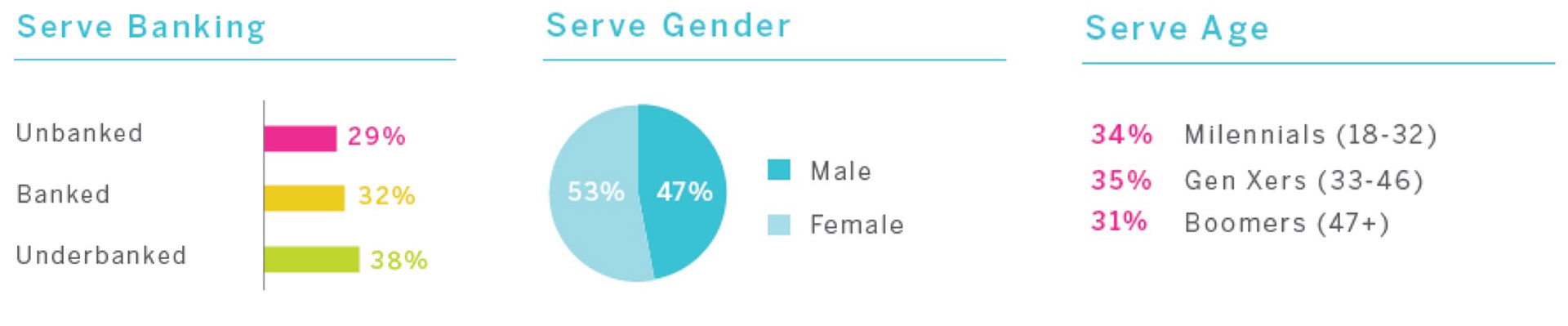
Target Demographic
The card is targeting the large unbanked and underbanked groups kept out by traditional banking systems. Serve aimed at acquiring these groups regardless of their financial statues, and providing them all the conveniences of having a bank card.
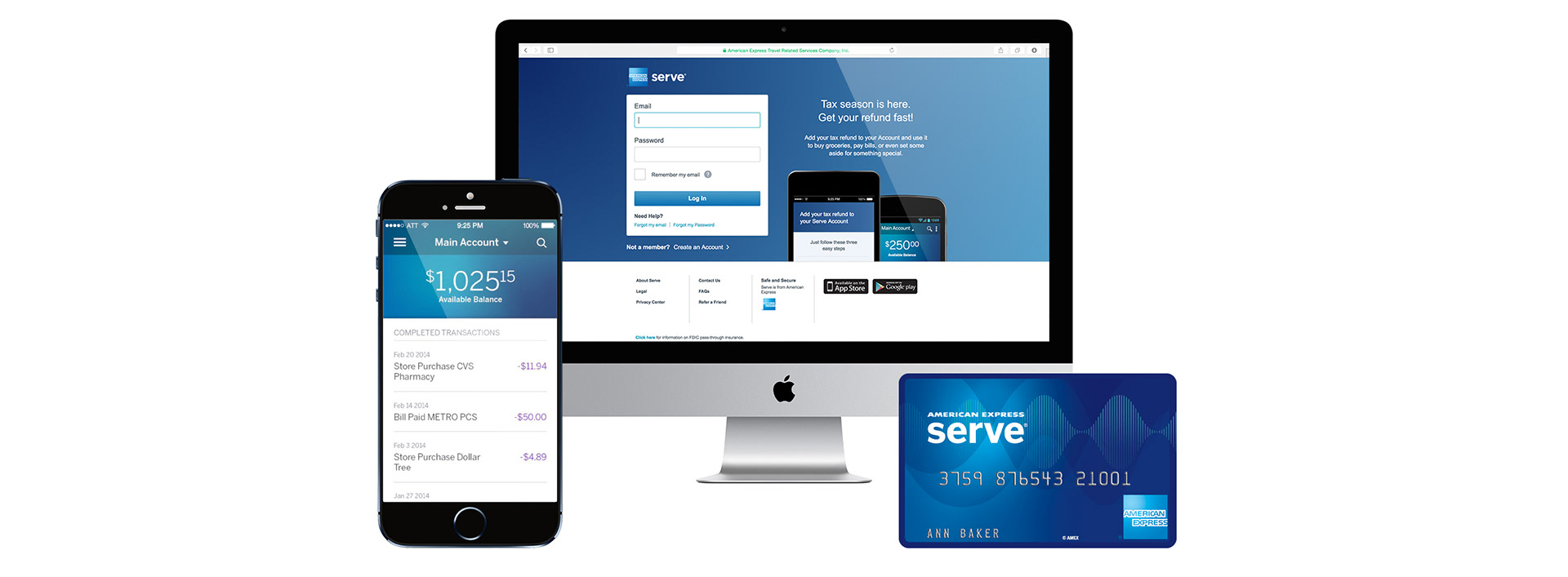
Serve Card Digital Platform
One of the biggest advantage of Serve card is its digital platform. It allows customers to serve themselves with account managing, budgeting, transfer, direct deposit and all kinds of other online banking features.
However, with big potential customer groups, well developed digital platform, and huge spend in marketing, Serve cards still don't sell well. The adoption rate is low since it launched. And in the meanwhile, even though some customers do purchased the cards, they only treated them as gift cards for one-time use. So AmEx is facing a problem:
"What can AmEx do to get more customers to adopt the Serve card as their long term banking alternative?"
Research and Problem Redefine
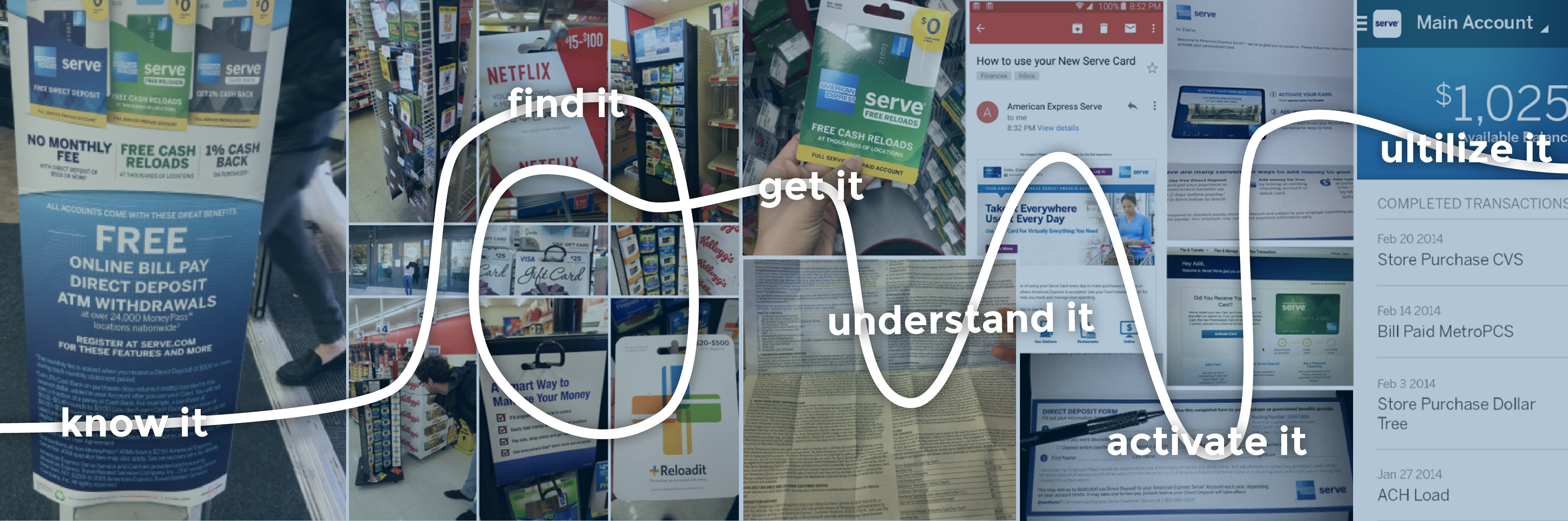
We simplified the challenge narrative as: for Serve card, AmEx wants customers to:
get it, use it, keep it.
But this is still a very big scope. It covers the entire journey of customers with Serve cards. To find out the current experience, we start our own journey with Serve. Every team member goes to stores, to experience the process from encountering Serve to actually using it. We document our detailed experience at our team tumblr.
Our Experience with Serve Card
In the meantime, we design and conduct multiple interviews at different locations such as discount stores, payday loans, check cashes, where more often the Serve's targeted customers will show up. The interview questions cover the people both who have and do not have bank cards, to collect their expectations, commendations or complains about bank cards.
On-site Interviews and Insights
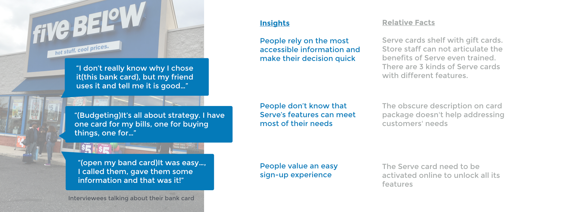
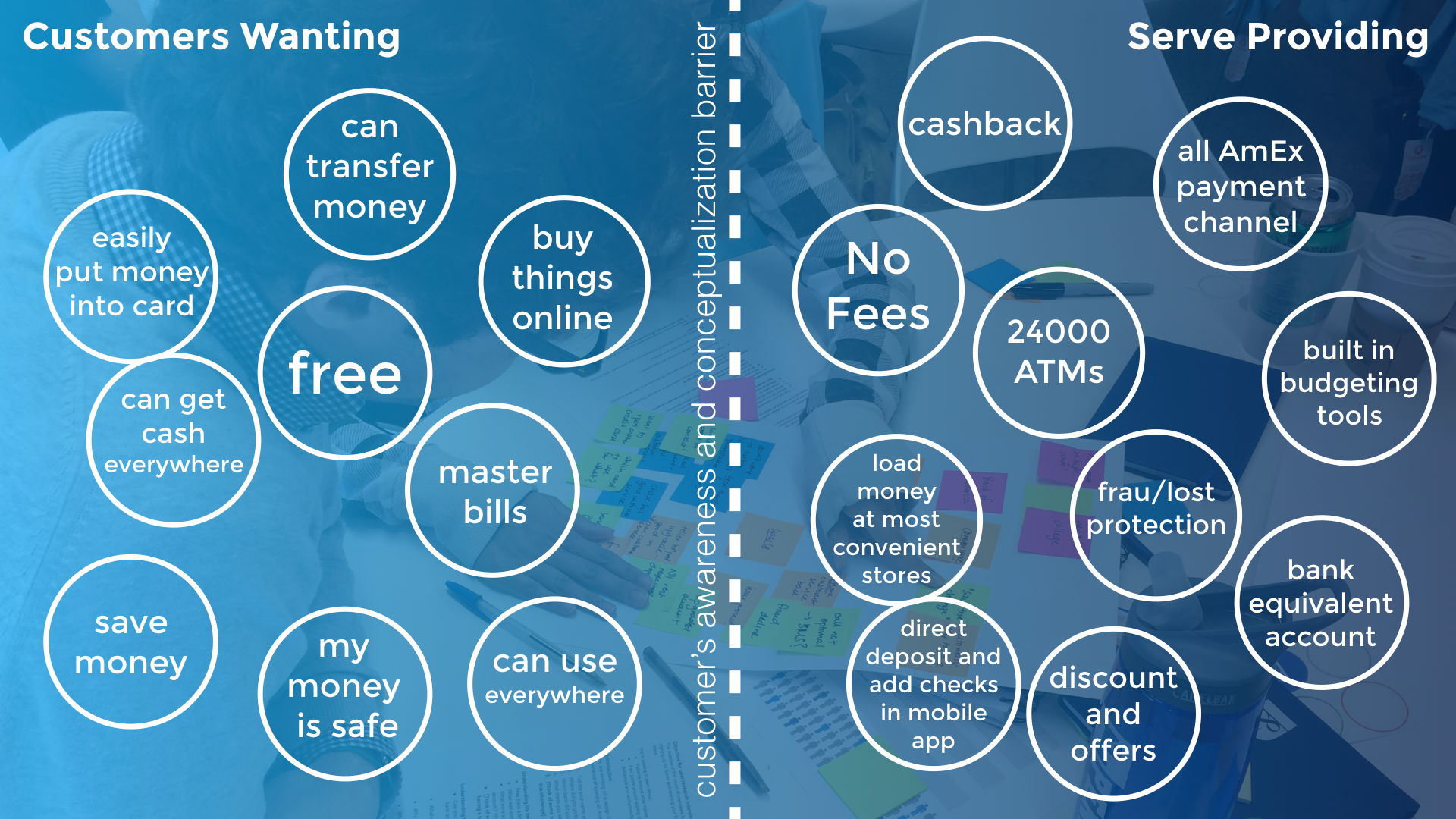
Comparing the interview results with the Serve features, we find that Serve card and mobile app actually address customer needs very well. We start to realize the real problem: here is a huge miss of awareness from potential customers to the card features. The benefits of the Serve cards are hiding at the very end of the customer journey. And the Journey from knowing it to activating it is long and unpredictable. People do not choose Serve card or give up using it because its values are often overlooked. So we redefine the problem to be:
"How can Serve be more engaging in generating awareness of its features?"
Ideation and Solution
The research kills a lot of our initial ideas, mostly about redesigning the Serve mobile app, such as in-app financial coaching, reward for mastering new features, or gamification of the feature discovering process. These solutions all just change the end chain of the customer journey, while the real problem is at the beginning of it. We need to find a way to provide a controllable experience from getting to know the card to activating it. This leads to our final design solution:
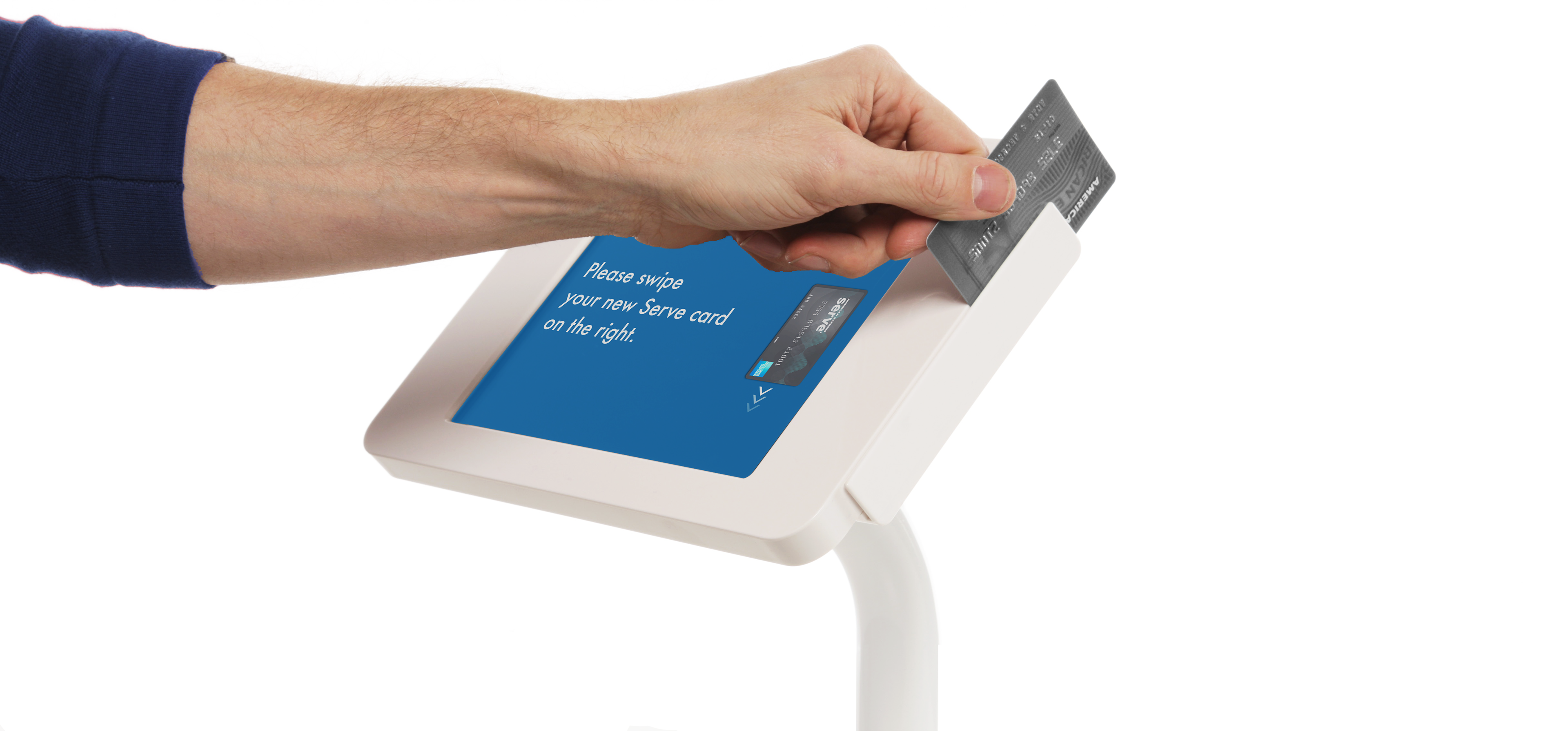
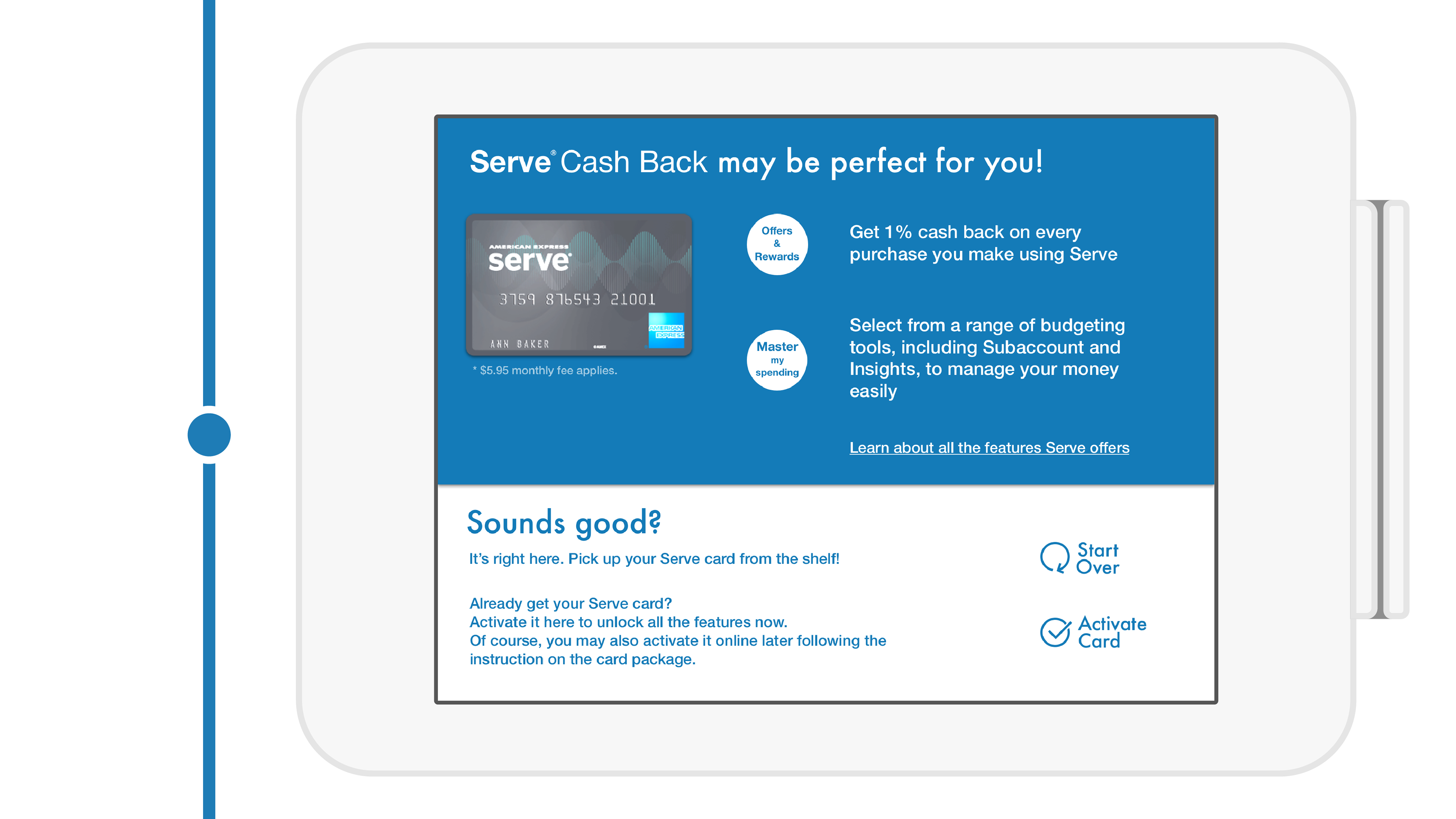
Add an iPad kiosk near the Serve card shelf in store to onboard customers
The inexpensive, iPad-based, card-reader-attached kiosk will serve 4 major functions:
1. As advertisement, Increase the visibility of Serve products, differentiate them from the rest gift cards on shelf;
2. Communicate the card value in a friendly and engaging way to potential card users, making sign-up easy;
3. Help the user choose the right Serve card based on their financial needs and habits;
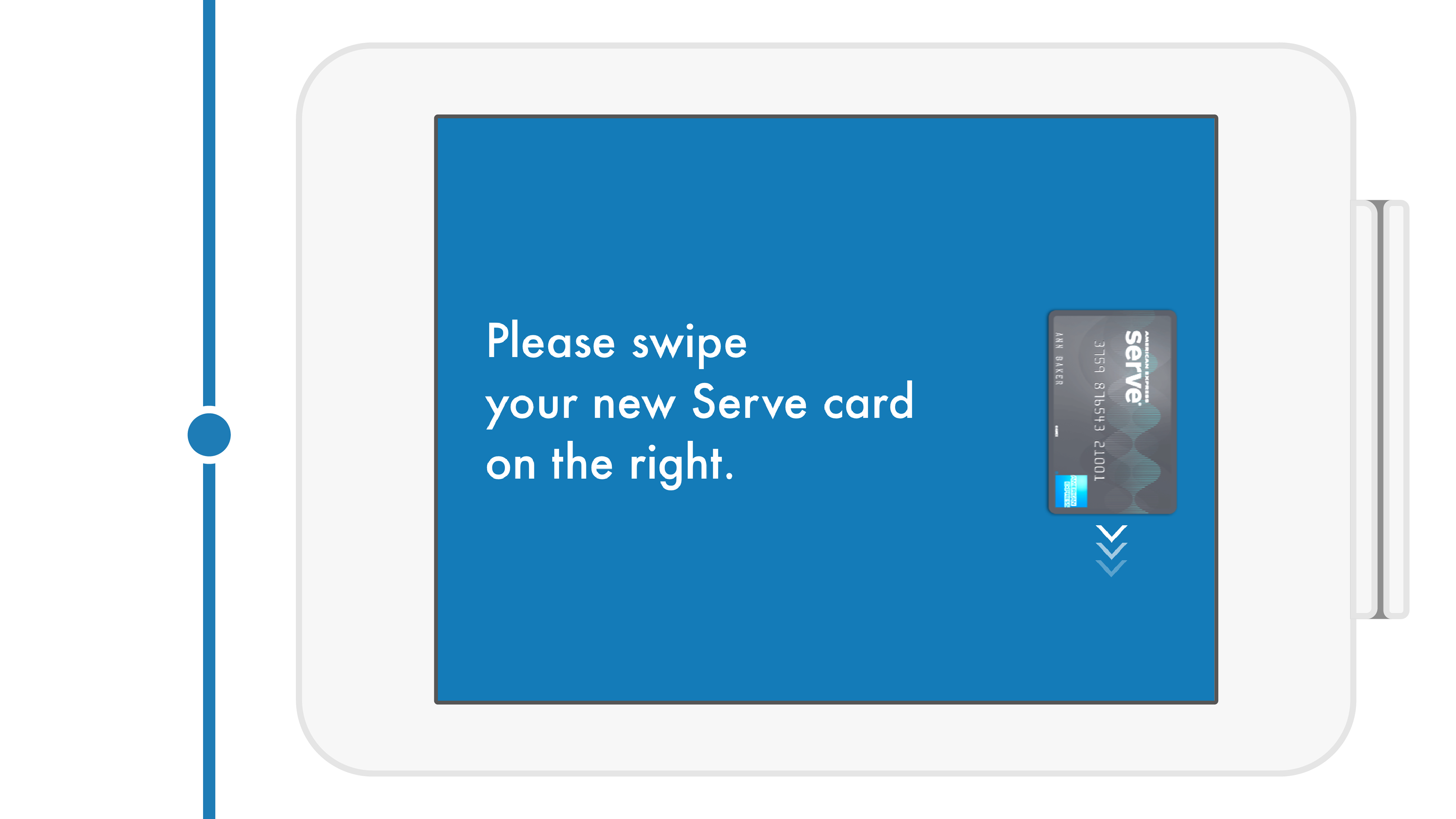
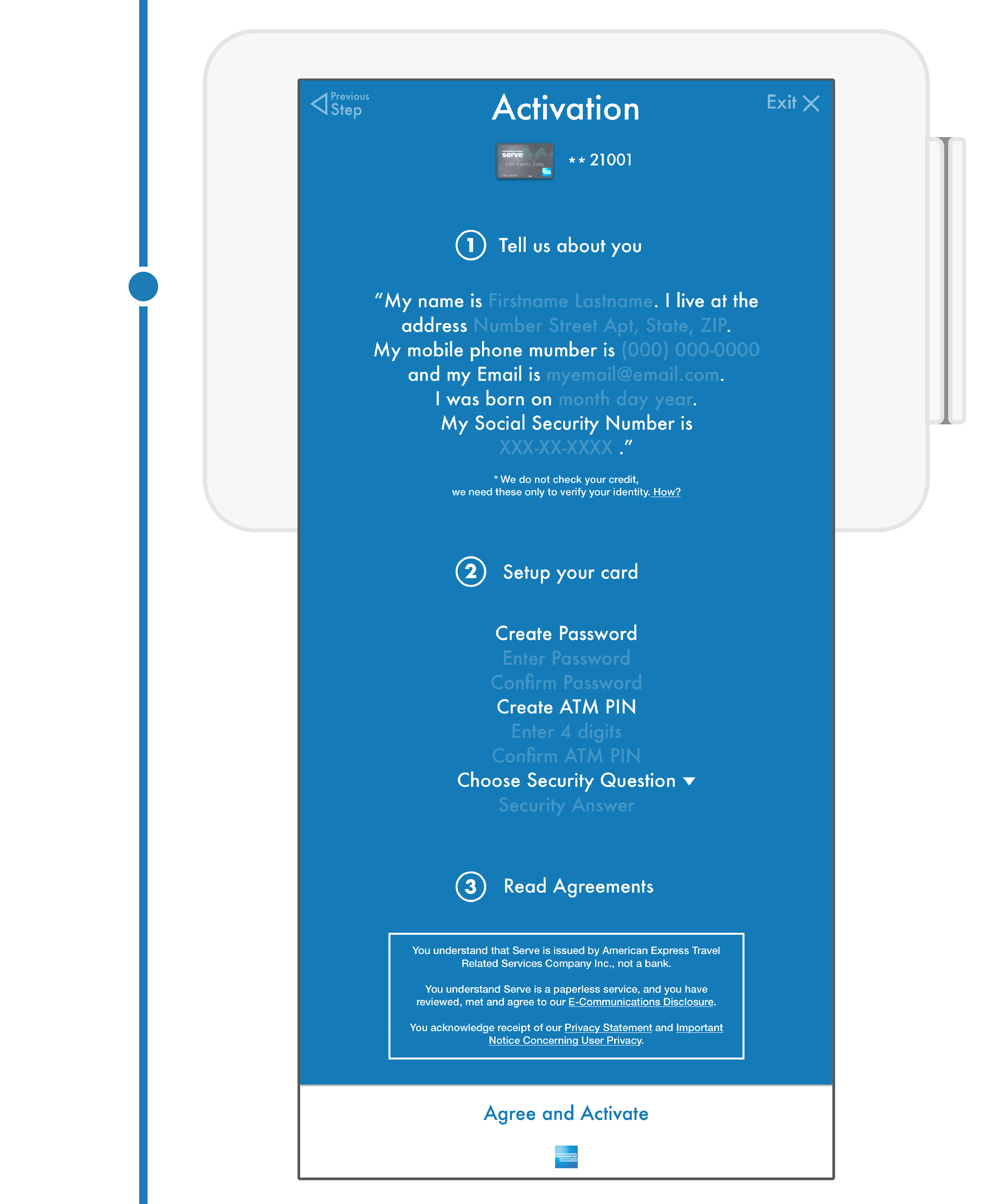
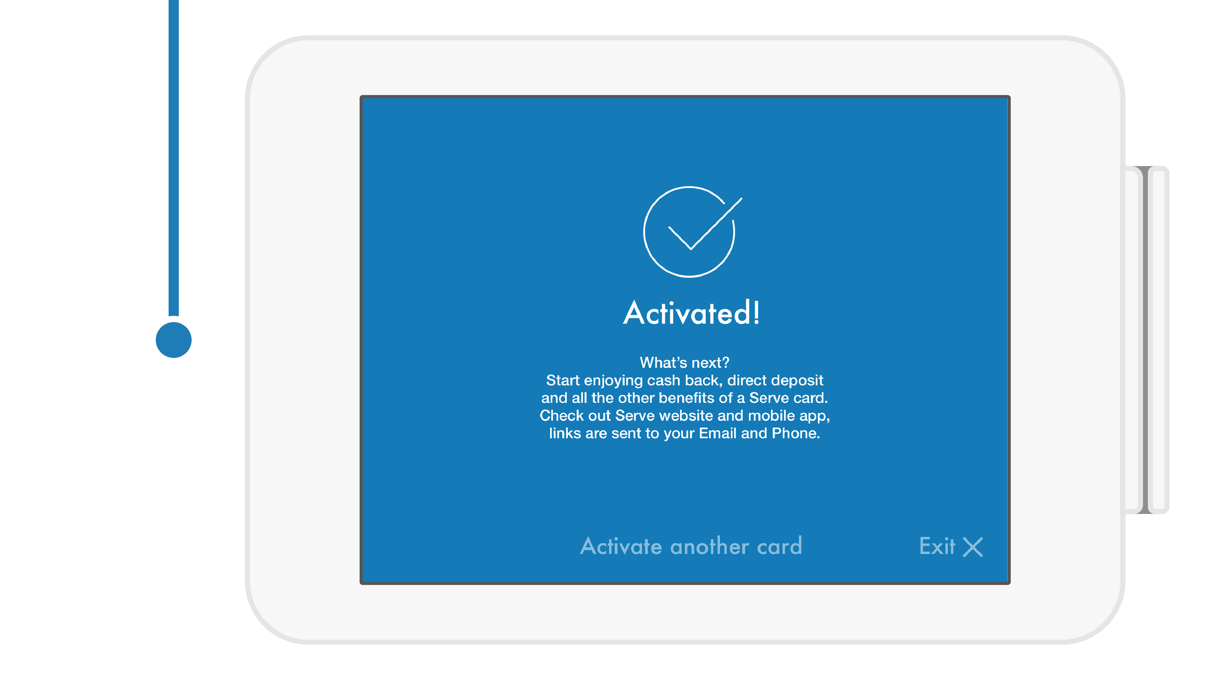
4. Allow quick activation and jump to use.
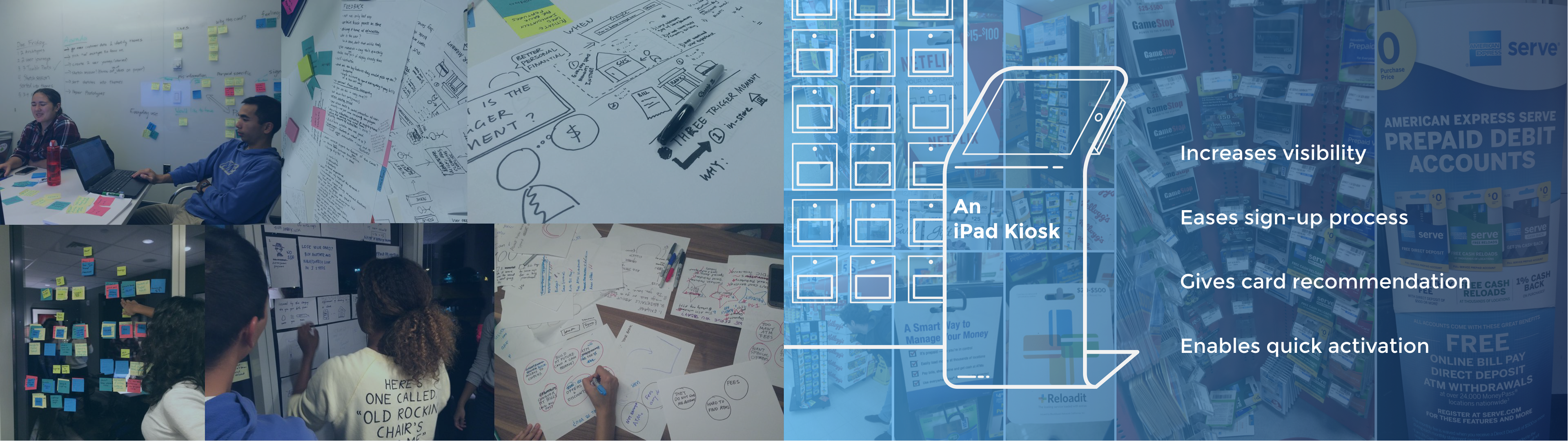
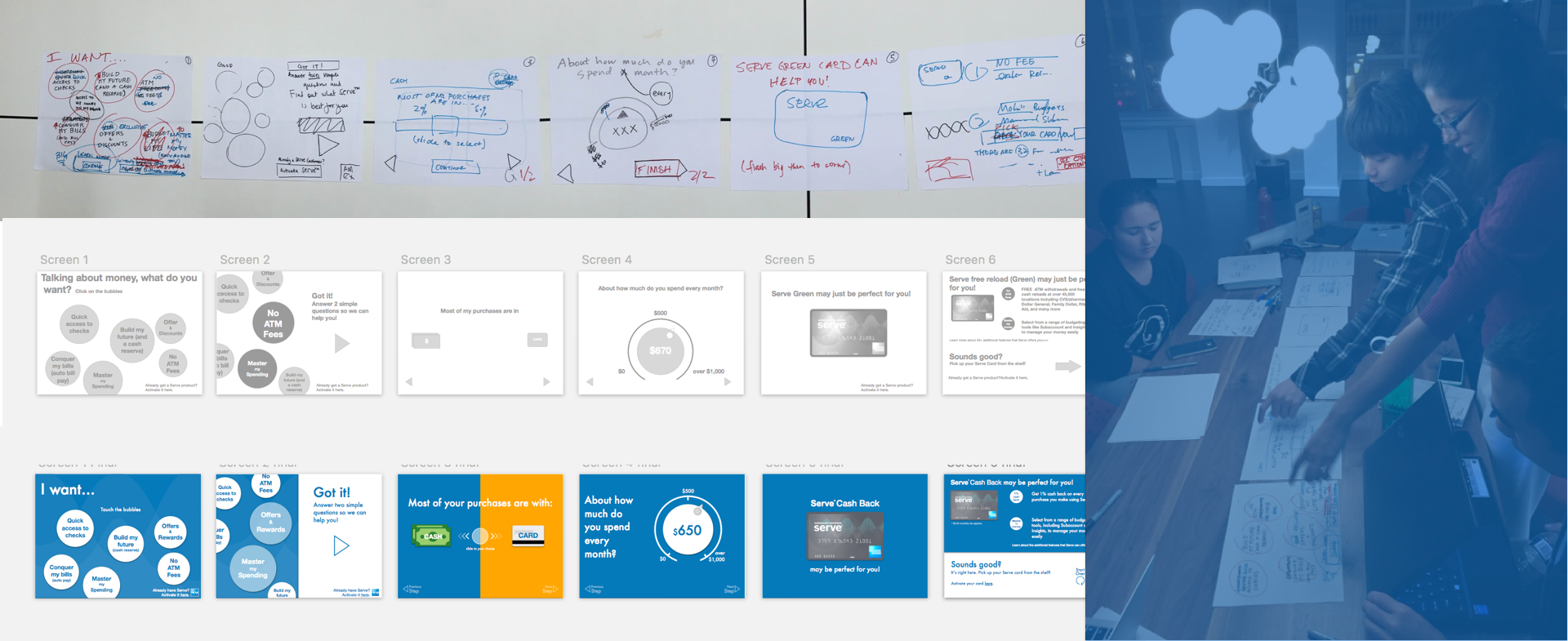
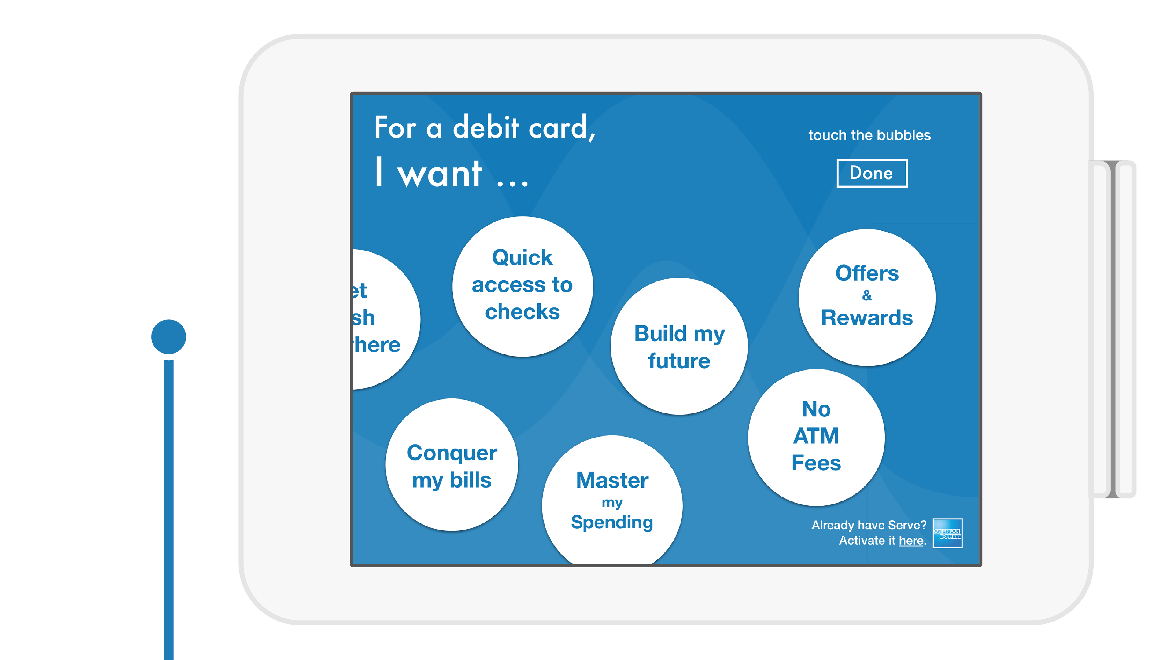
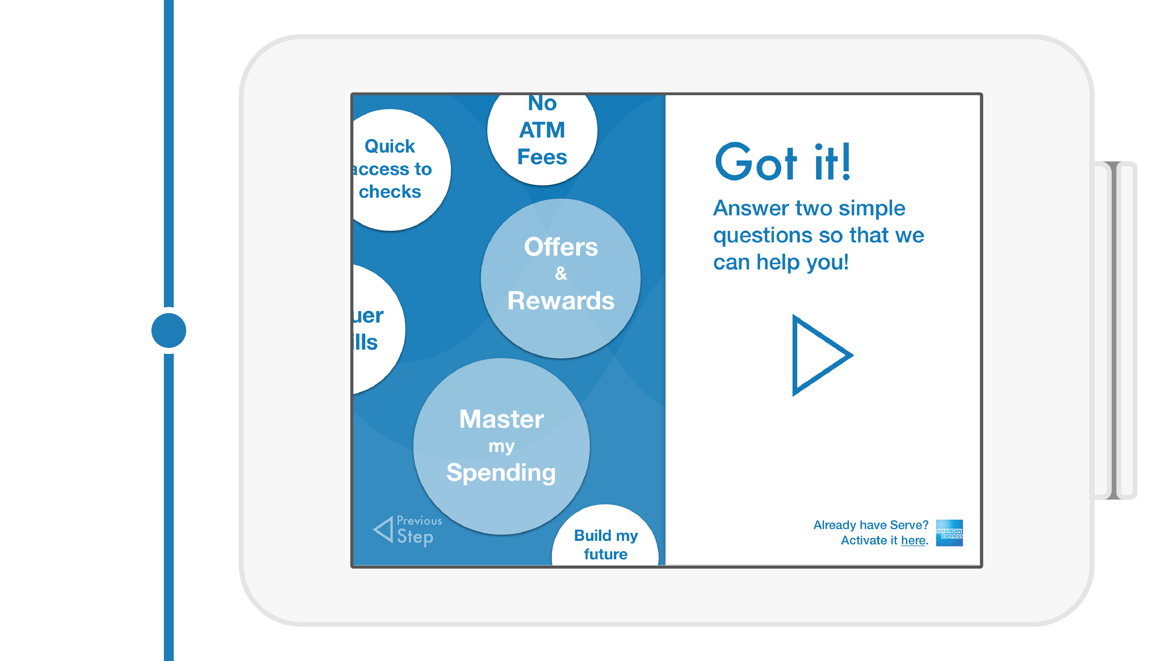
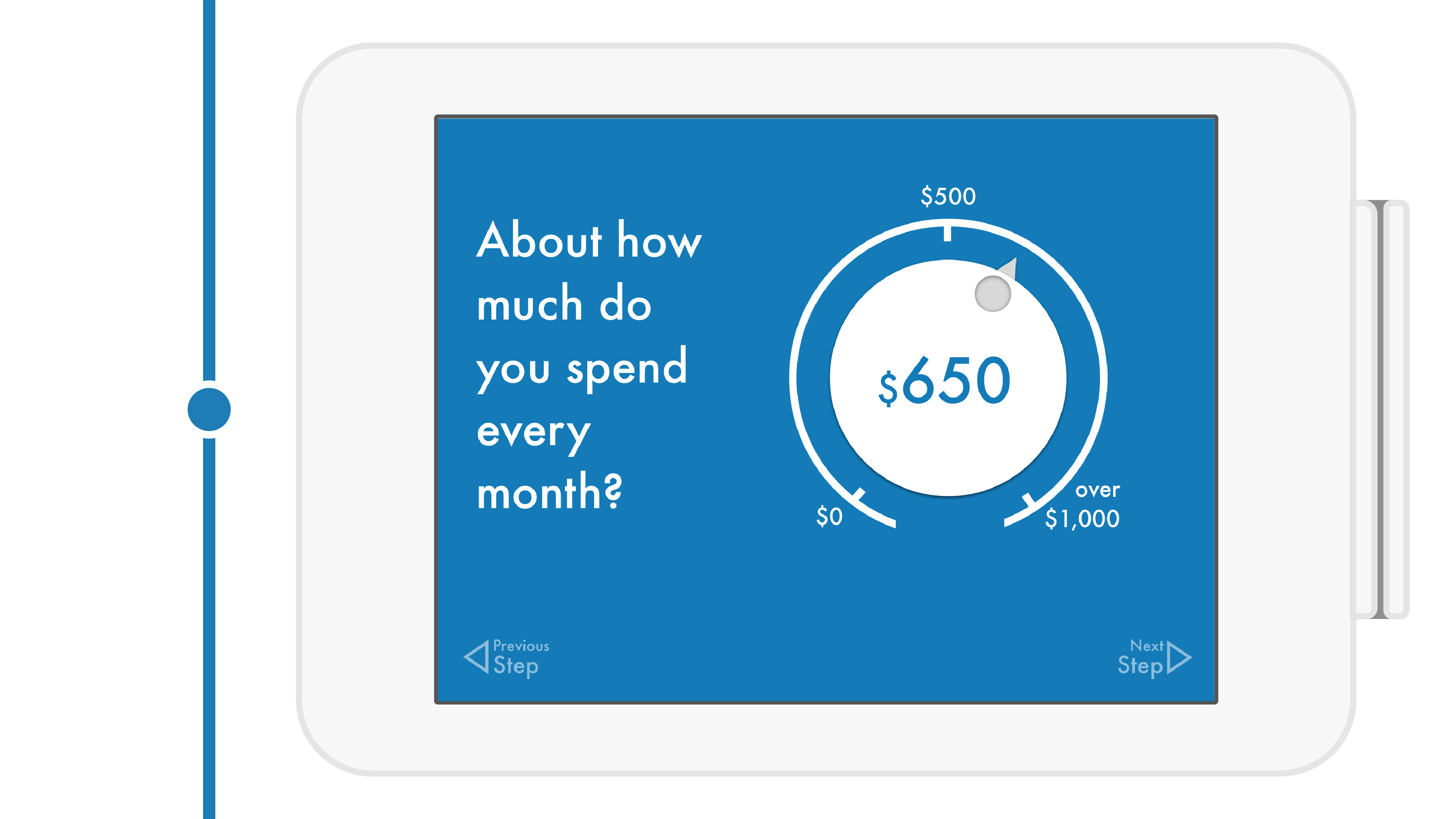
The next task is to design the interface on the kiosk. The team works closely to sketch the process out on paper. We designed a step-by-step Q&A interface to lead the customer through the journey of getting attention, identifying needs, collecting financial habits, recommending suitable card, explaining relevant features and proceeding to activation. In our first version, there are 10+ steps. We reduce them into no more than 4 in final version by carefully analyzing feature difference among 3 kinds of Serve cards and having debate about which steps are necessary. When each interface is locked and drafted, as a designer, I design interaction and visuals to make answering questions a fun process.
The flow

The Front End Interface
The Kiosk Experience


Project Review
Because of our team's unique solution and well executed design, we win the first prize of the challenge and are invited to American Express' headquarter to present our proposal to AmEx's UX team and Marketing team. But there are many things could be done better. Due to the short project term, instead of making a Hi-Fi animated interactive prototype for public test, we only test with rough clickable prototypes inside team and small group of friends. And, we only mockups the main flow. There could be more consideration about branches, such as checking feature details, reading/sending agreements, or start over in the middle.